I led an extensive research process that included online surveys with follow-up calls and in-person intercepts. After the analysis was complete, the results were so valuable, I was invited to present research findings to other departments within the bank.

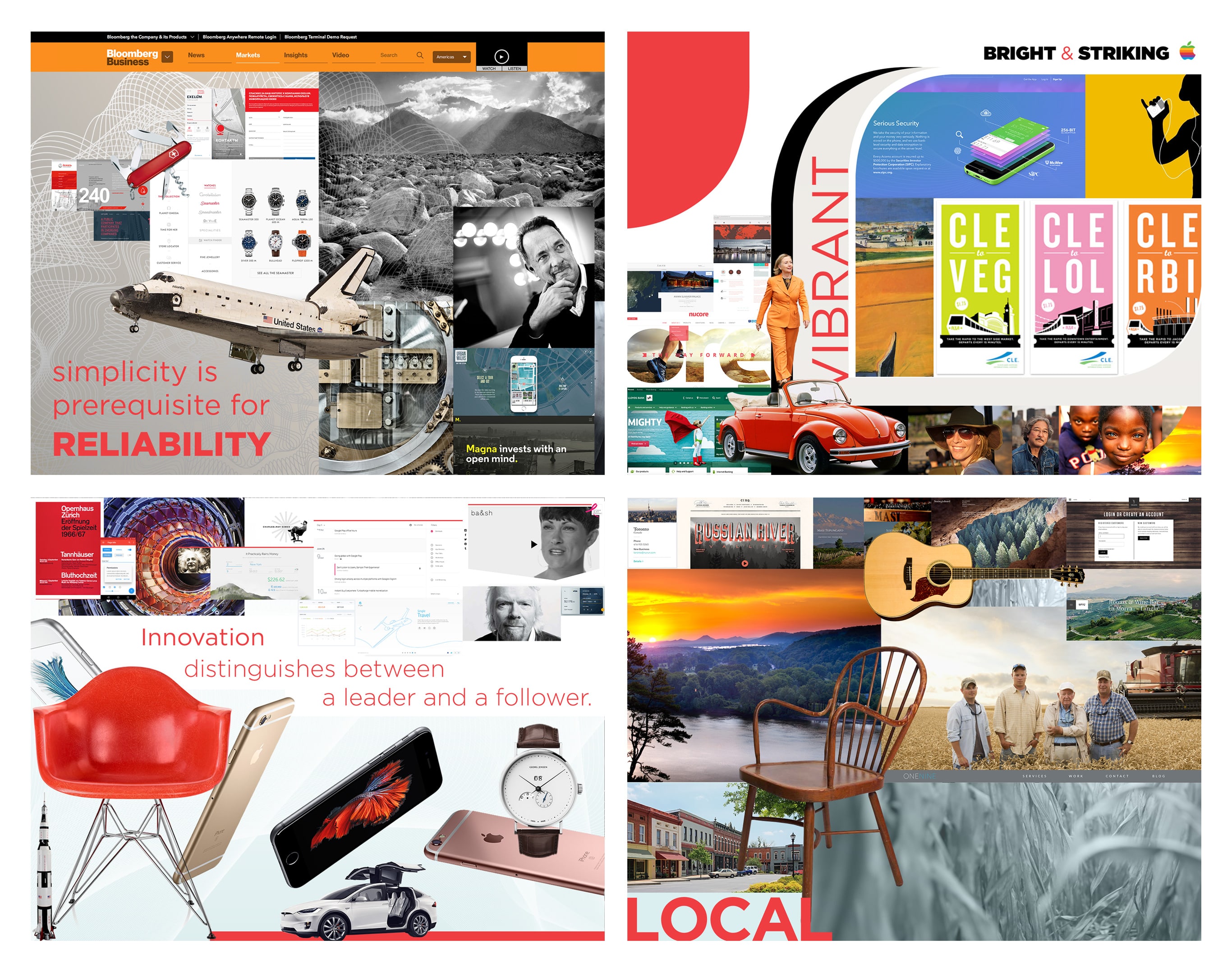
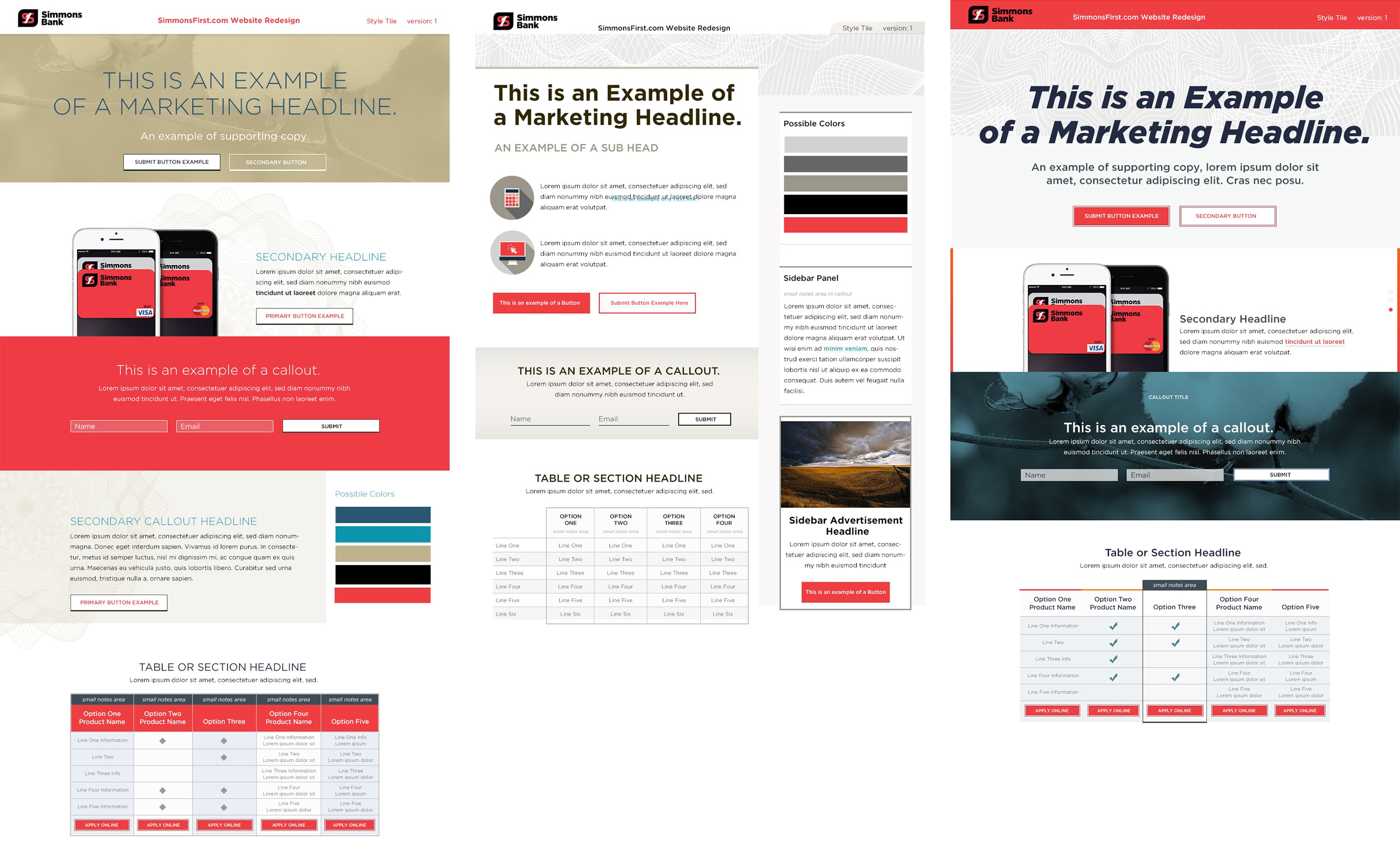
As part of an exploratory process for the evolution of the brand, I designed and led workshops with bank staff on mood boards, style tiles and persona development.

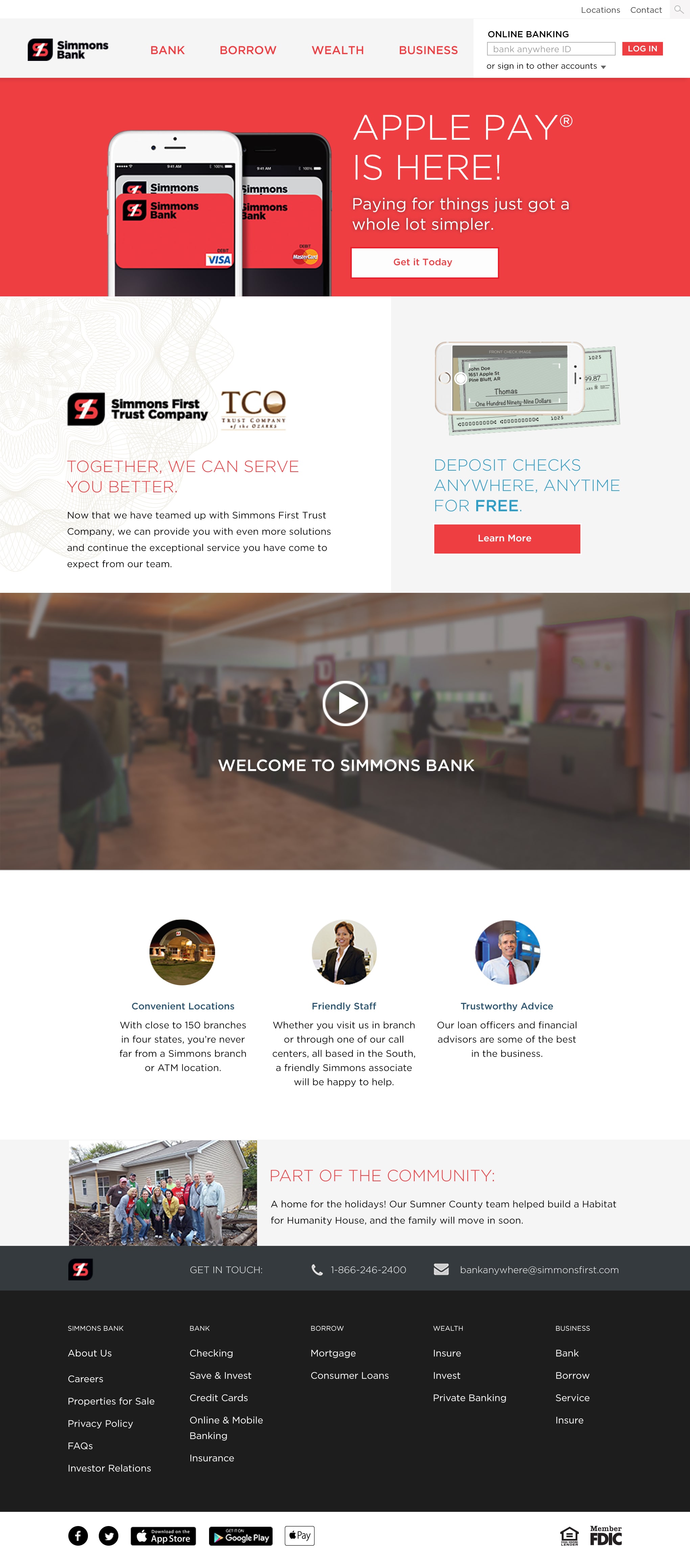
The design system created for Simmons Bank is extendable set of reusable components that can be combined at any part of a 12-column layout. The visual styles reflect the refreshed brand and reference the multi-year Dreams: Realized advertising campaign without being limited to any single campaign.
